Styling
For the Accedo Build Elevate Solution we follow the next conventions
- CSS Modules Modular and reusable CSS.
- Sass with
*.scssfiles as the CSS processor - ClassNames As a helper tool to use multiple and/or conditional class names
- Stylelint as style linter
- Components and
*.scssnames should be the same
You can import these *.scss files from the JavaScript files, for example:
// Button.js
import styles from './button.scss'
The content of styles will be an object with the class names as keys, and a random string as value. This is because the project is using CSS modules, which allows to repeat the same class name in different files avoiding name clashes.
Style Classnames
We use SASS for styling.
Per configuration, the class names with multiple words, are split using dash (-) for definition but camelcase for usage. That'd be:
In the scss file we have
.suggested-container {
  @include horizontal-layout;

  margin-bottom: vw(20px);
  width: 100%;
}
In the Js file we use it as:
import theme from './stylingFile.scss';
<div className={theme.suggestedContainer} />;
In order to make everything clear to the developer, when you are working in dev mode, the result in the DOM tree for the class names is like:
class="[styleFileName]_[actualClassName]_[hash]"
<div class="heroItem_title_1sxdE">[Elevate] of Banner Spider Man</div>
On the other hand, for the production environment, we will only see the hash.
class="[hash]"
<div class="_1sxdEoSSSDuy-McAx9oQTd">[Elevate] of Banner Spider Man</div>
Resolution
The application must support 1080 and 720 resolution. For doing this, the messures in the designs are given for a 1080 resolution, so for making the style in the scss files, the values must be for 1080. In order to have the 720 values as well, we must use the function vw($n) so, for every px number in the scss file, we must use that function. For instance: margin-bottom: vw(18px); Remember to import the main.scss or the vw.scss file in order to have access to that function.
@import '~#/theme/vw.scss';

.logo {
  height: vw(64px);
  width: vw(64px);
}
Theming
Introduction
Themes comes from Control and are dynamic. It's possible to have more than one theme and they are associated to one or more pages, that is, each page has it's theme, but if not, at the application level, when a page is loaded, it receives the local default theme as a fallback.
Please, check the provider section for more information about how themes are retrieved from Control.
Page data model includes Theme data model, that provides information about colors.
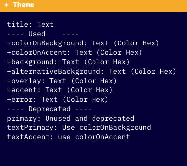
This color information can be different for each page, so Elevates follows to be used in the scss files.
Usage
Scss files uses css variables for the color information. By default, all pages that are wrapped by PageLayout (src/containers/PageLayout/PageLayout.js) sets their own css variables, based on their theme associated to it, by default. You can check what pages are wrapped by PageLayout at Routes (src/config/routes.js), but in resume, are all pages that comes from Control.
You can face some specific scenarios where you will need to set it manually (i.e. fallback pages), and in that case you can use setCssVariables.
The application creates the following css variables at boot.
const setCssVariables = theme => {
  const style = {
    '--accent': theme.accent, // focus color
    '--alternativebackground': theme.alternativeBackground, // skeletons, other backgrounds
    '--background': theme.background, // page background
    '--coloronaccent': theme.colorOnAccent, // text color on focus
    '--coloronbackground': theme.colorOnBackground, // main color for regular text
    '--error': theme.error, // error text color
    '--overlay': theme.overlay // overlay color
    '--disabled': theme.disabled // disabled buttons or links
  };
  const r = document.querySelector(':root');

  Object.keys(style).forEach(key => {
    r.style.setProperty(key, style[key]);
  });
};
Then, the scss can use this variables in the static files.
  &.background-focused .click-area {
    border: solid vw(9px) var(--accent);
    position: absolute;
    top: 0;
  }